BRAND IDENTITY | PRINT & APPAREL
BRAND IDENTITY | PRINT & APPAREL

PROJECT OVERVIEW
For Payment Genie, I developed a complete visual identity, from initial concept sketches and custom mascot illustration to a flexible logo and typography system. The goal was to create a recognizable brand that balanced a playful personality with the professionalism expected of a financial services company. Over time, I expanded the identity across business cards, including a specialty silver-foil design inspired by a credit card, bilingual promotional materials, and branded apparel. Each application was designed to maintain consistency while adapting to different formats and production requirements.
Logo Design & Development
Concepts & configurations
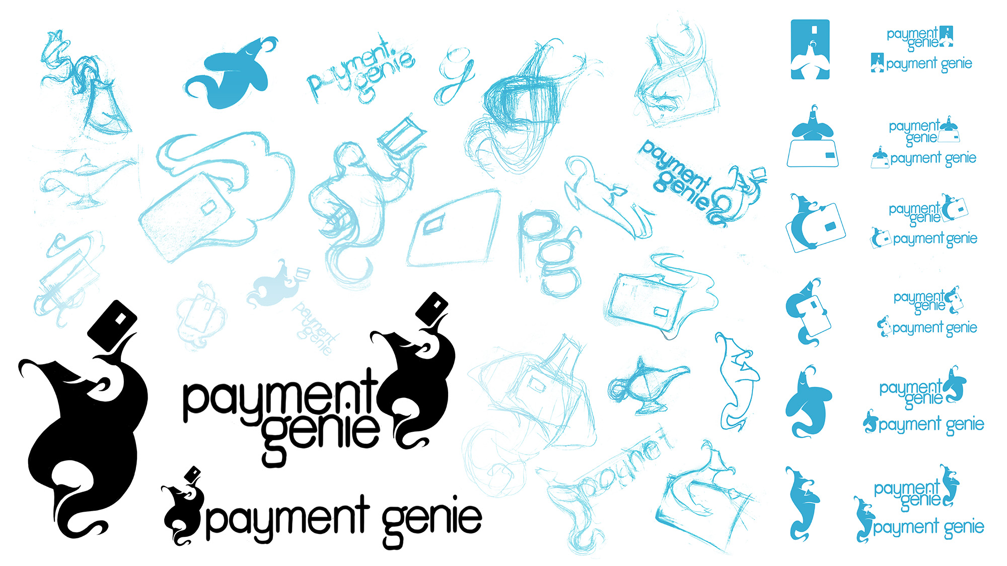
Following our initial discovery meeting, I explored several creative directions that would balance a fun, energetic personality with the professionalism and trust expected of a payment processing company.
Early concepts drew inspiration from magic, genie lamps, money, and payment cards, but the genie quickly emerged as the strongest concept. Since many of Payment Genie's clients operate in the food service industry, I developed the character with a waiter-inspired pose, presenting a payment card as a dish.
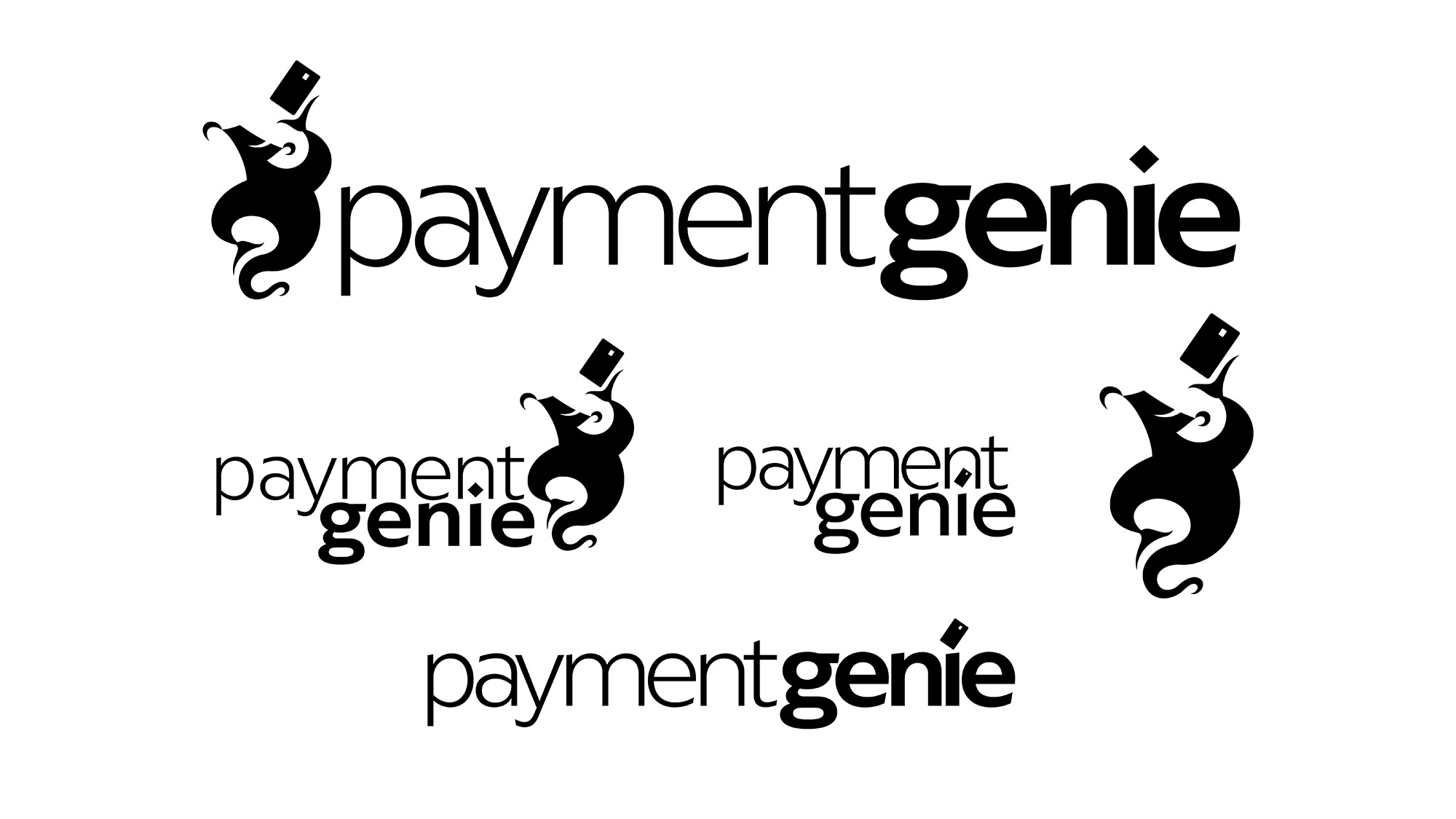
From there, I developed several logo concepts for the client to review, exploring different ways to bring the character, typography, and payment imagery together.
Initial Sketches & Early Logo Exploration
Refined Vector Concepts & Logo Configurations

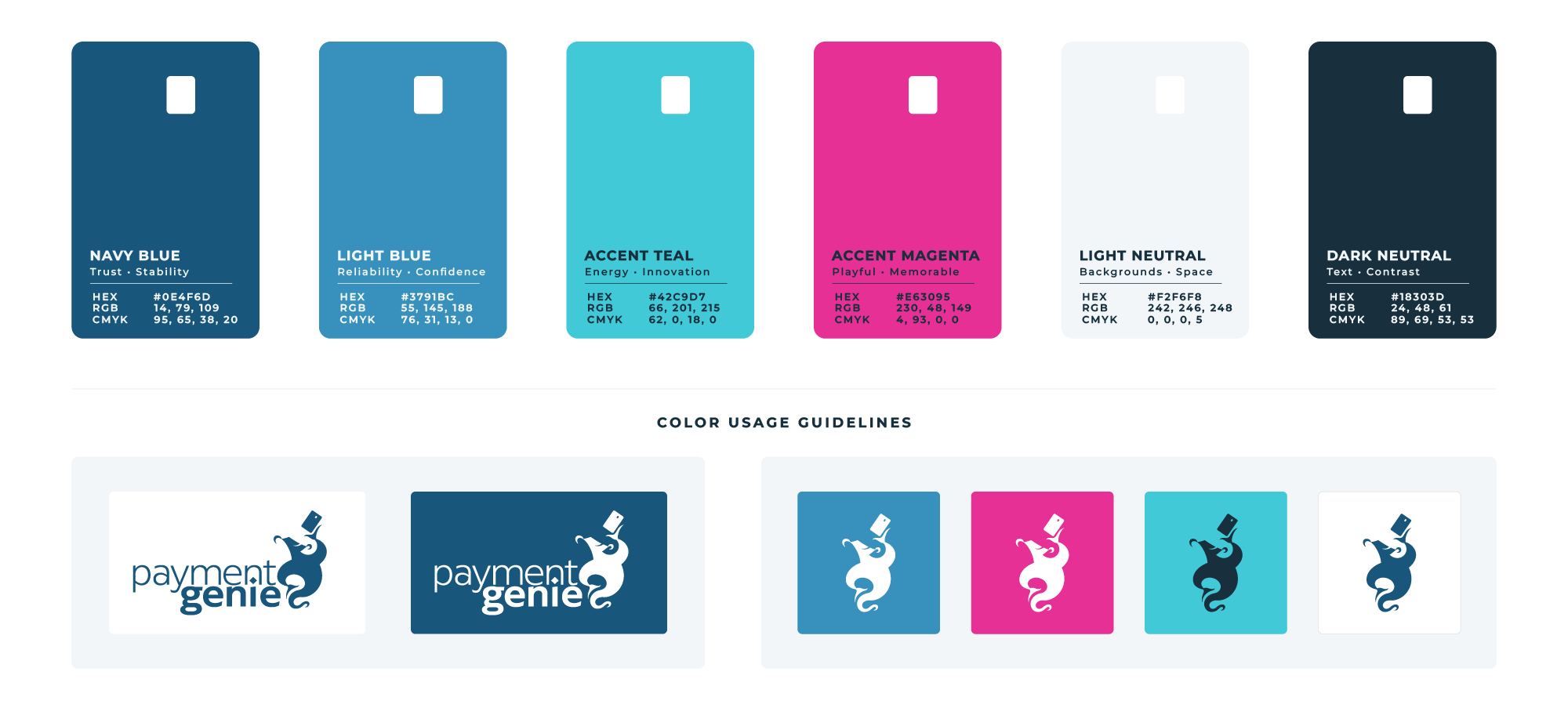
COLOR PALETTE
The Payment Genie color palette was developed to balance professionalism with the brand's playful personality. Navy and blue to establish a sense of trust and reliability, while vibrant magenta and teal introduces energy and contrast. Dark and light neutrals provide flexibility across print, digital, and apparel applications.
The palette was designed to work cohesively across different media while allowing individual colors to stand on their own. The credit card silhouette, carried over from the original logo concept, adds a subtle visual connection to the brand.
Typography
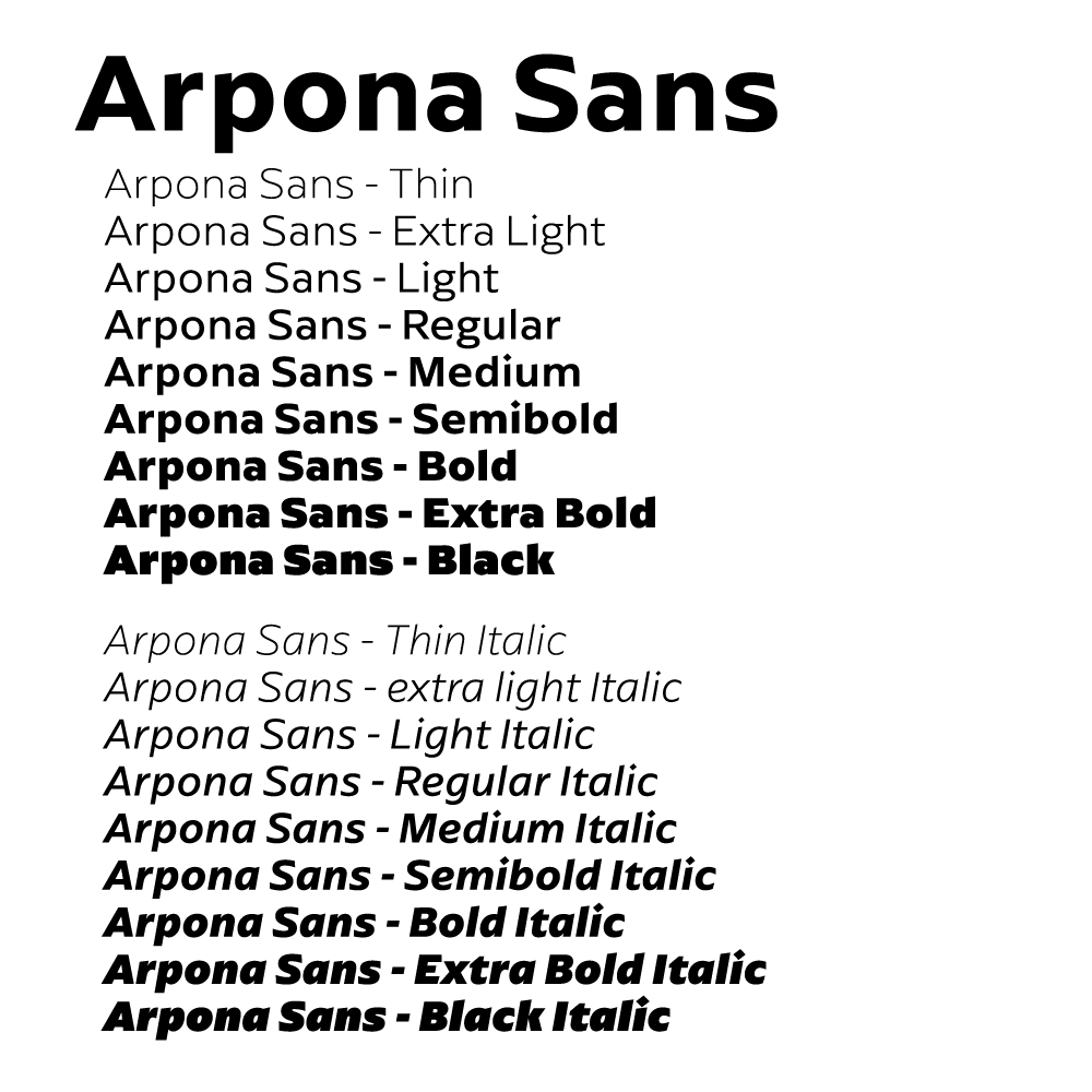
Arpona Sans was selected for its versatility, distinctive letterforms, and ability to complement Payment Genie's visual identity. Its combination of smooth curves and sharp details reflects the characteristics of the genie mascot creating a cohesive look across the brand.
The typeface offers a wide range of weights and styles, providing flexibility and a consistent visual hierarchy across both print and digital applications. Practical usability was also a consideration. Selecting a typeface the client could readily access helped ensure the brand could be maintained consistently without requiring a designer for every new application.
Font Use in Logo
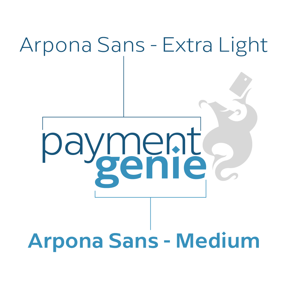
Type Family & Weights
Complementary Letterforms

Branding in action
With the visual identity established, I worked with Payment Genie to bring the brand into the real world. From specialty business cards and promotional flyers to branded apparel, each piece was designed to maintain a consistent look while adapting to different formats, materials, and production requirements.
These applications demonstrate how the identity extends beyond the logo to create a cohesive, recognizable brand across everyday customer interactions.
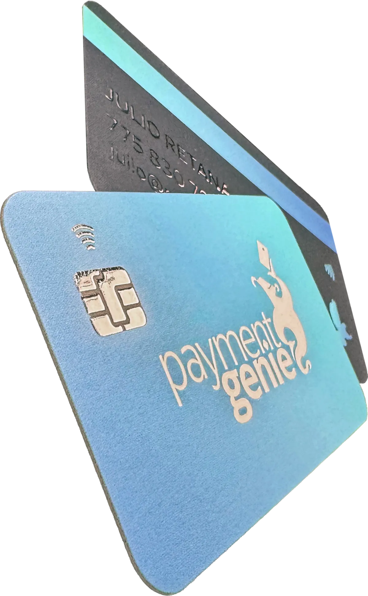
Specialty Print Business Cards
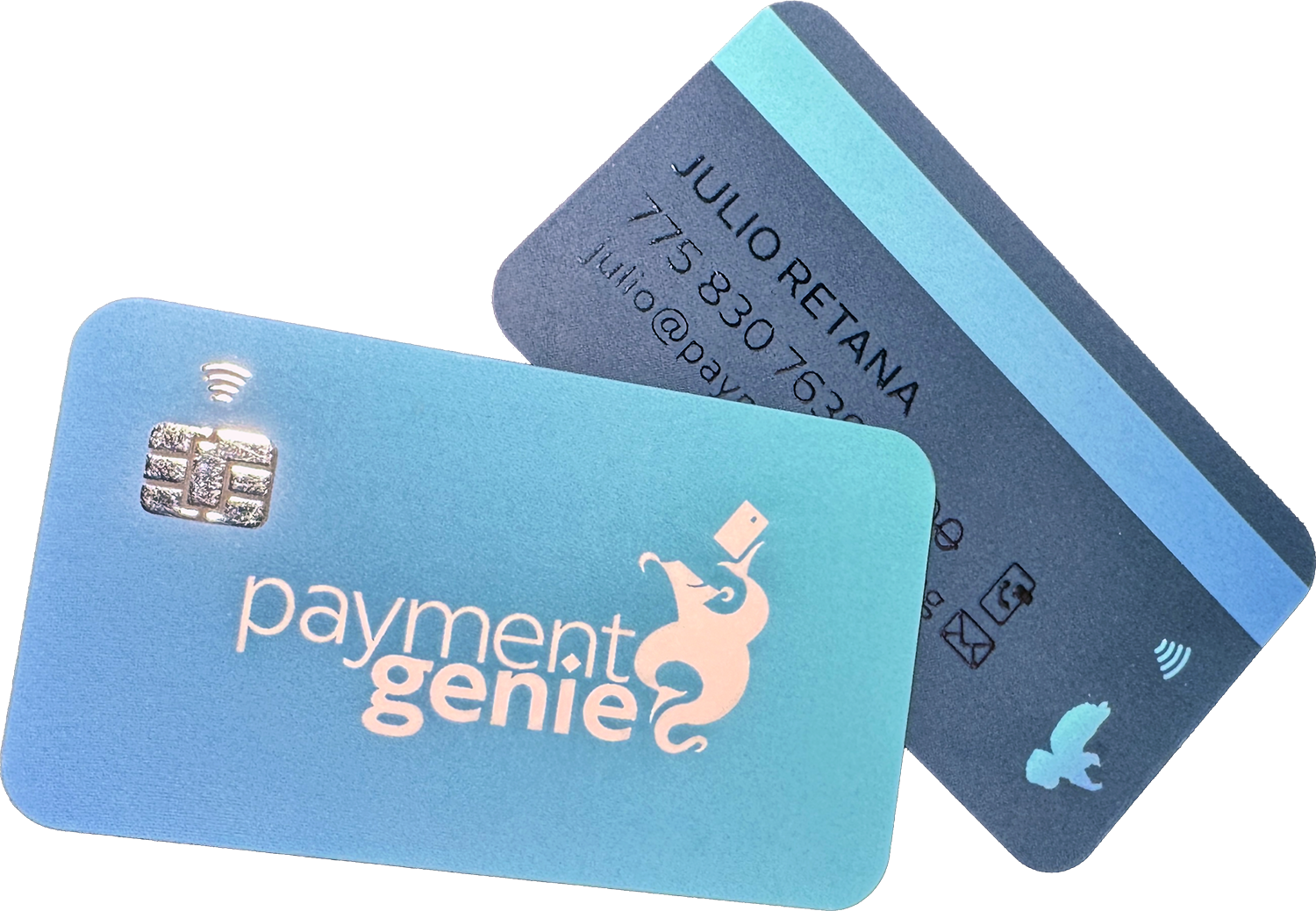
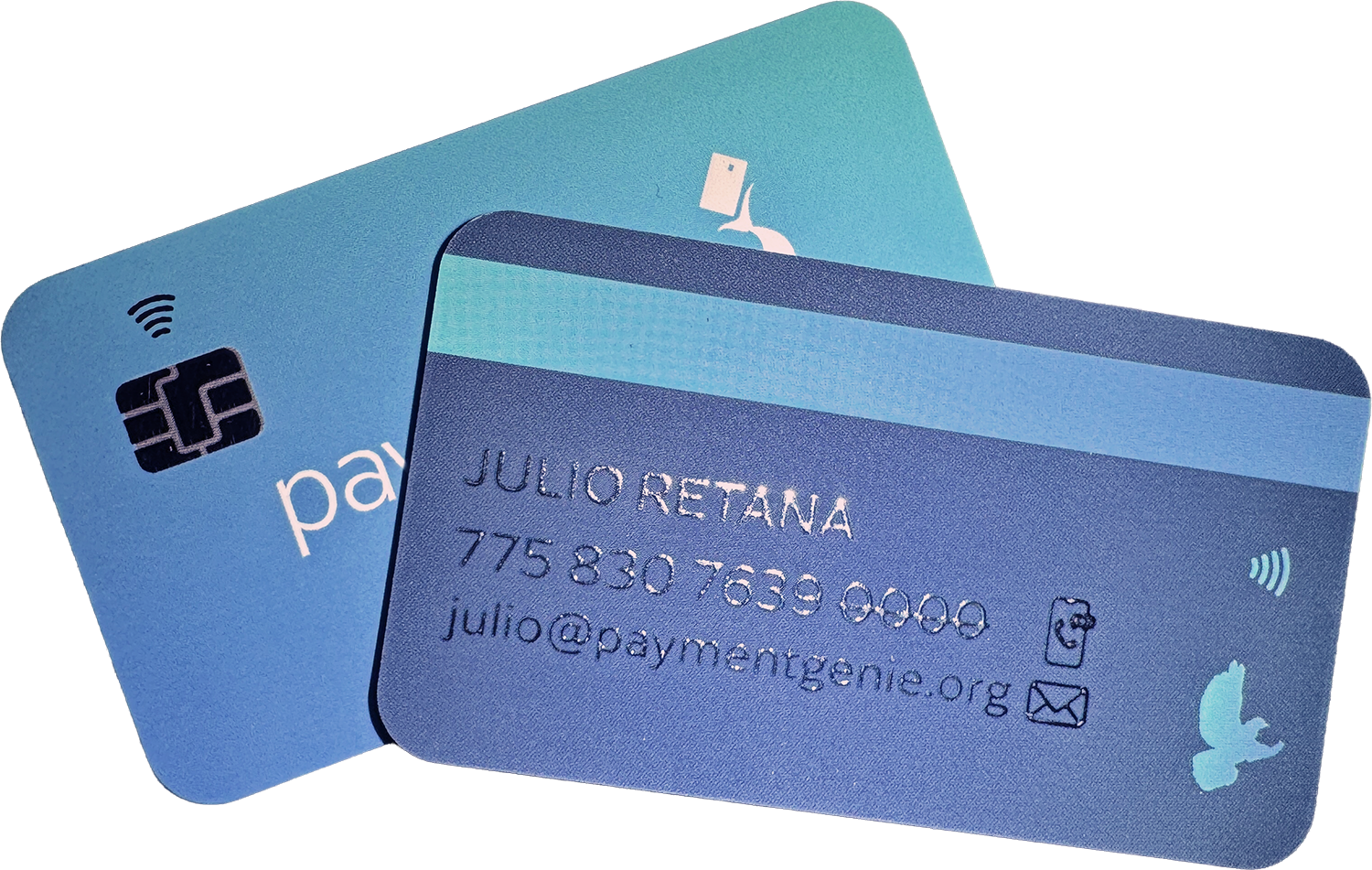
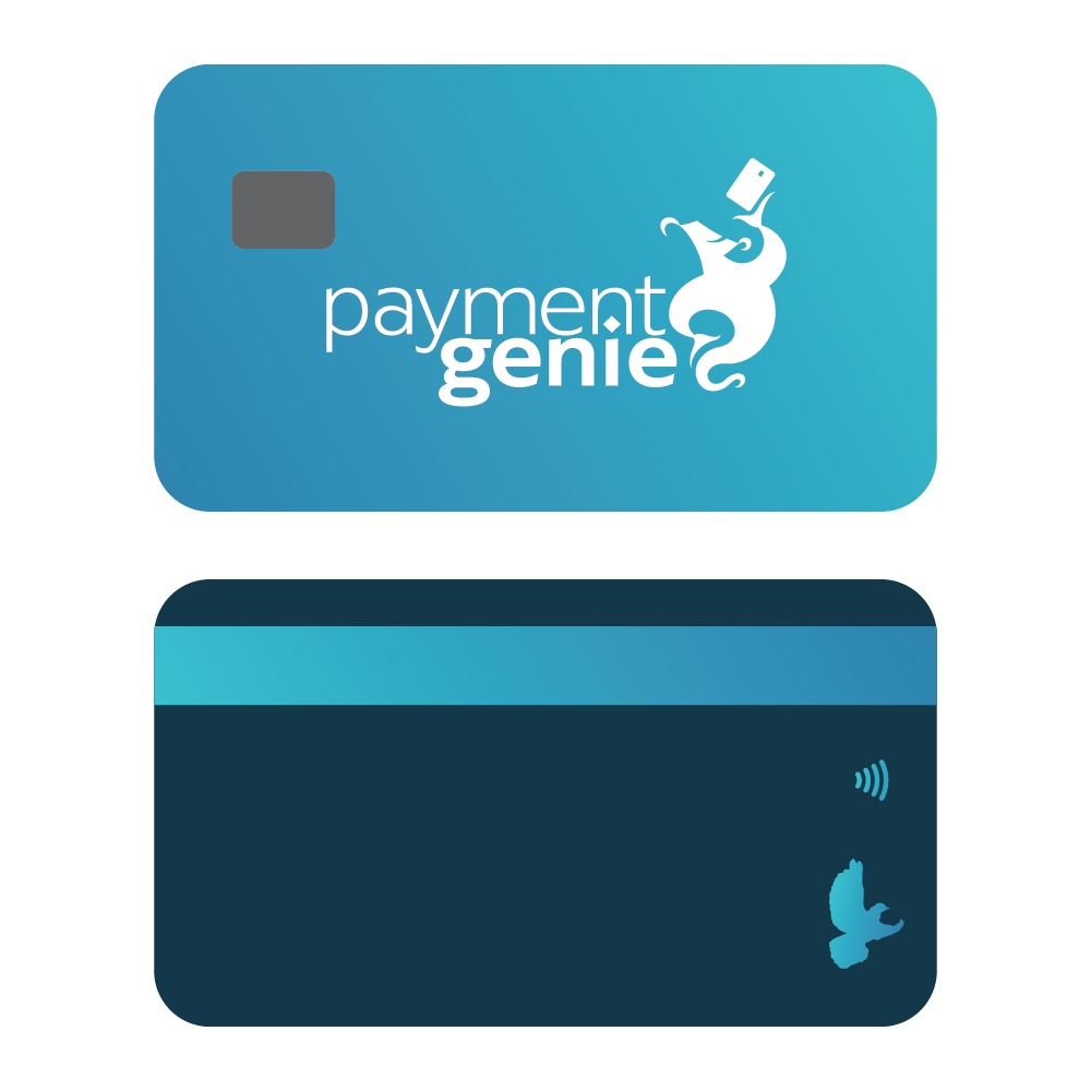
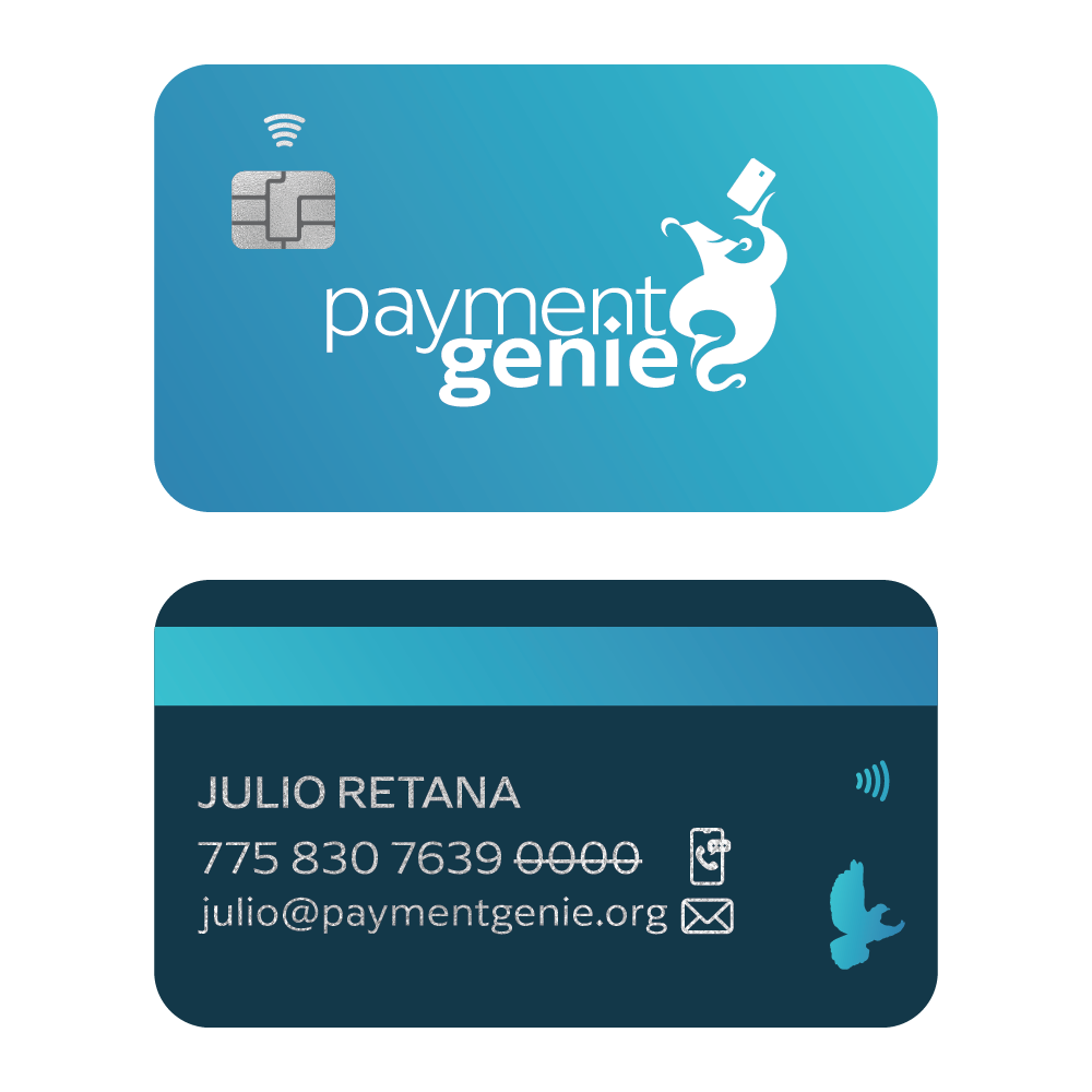
To connect Payment Genie's business cards directly to the payment processing industry, I developed a design inspired by the look and feel of a credit card.
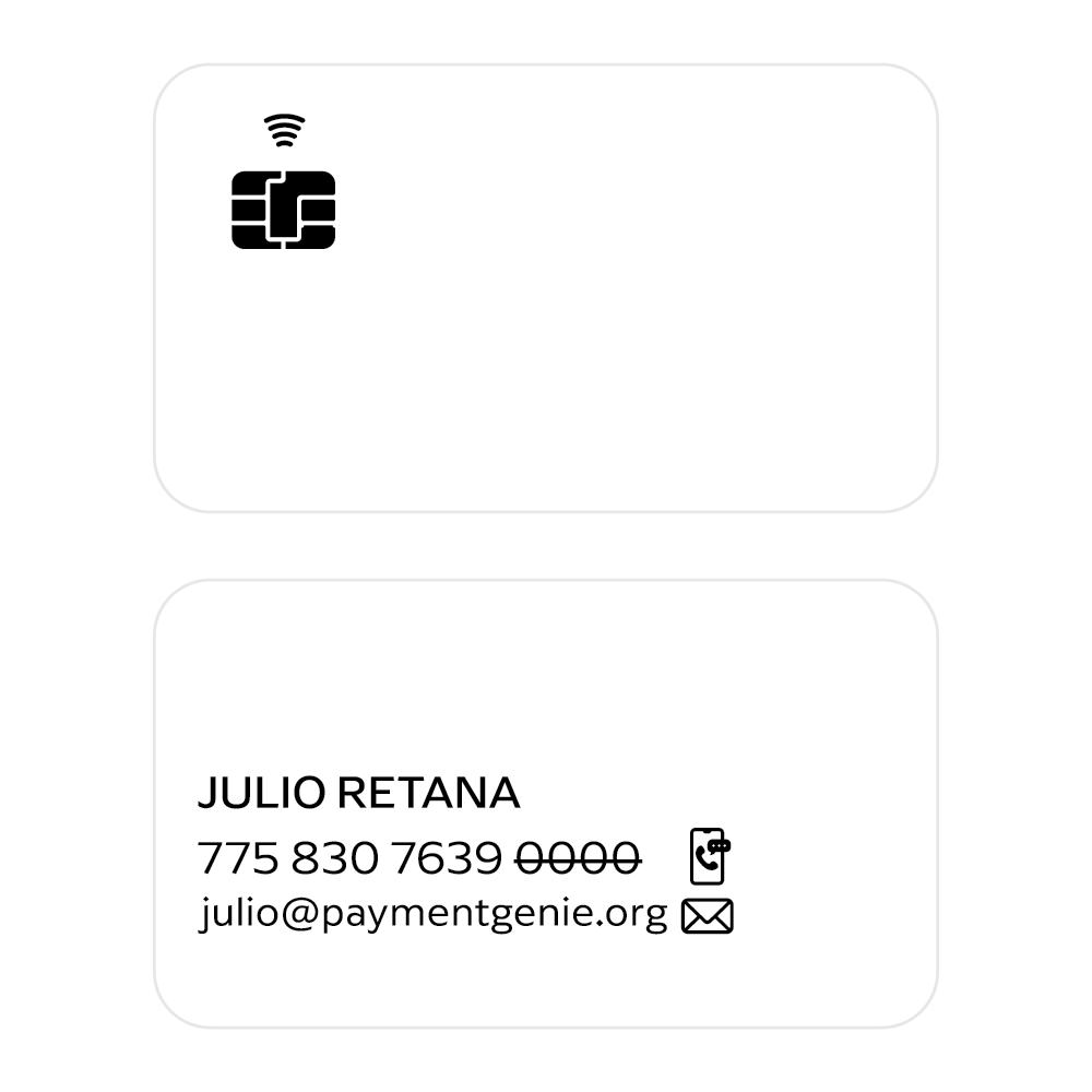
The front incorporates raised silver foil to replicate the appearance of an EMV chip and contactless payment symbol, while the reverse uses the same treatment for contact information, positioned where traditional credit card details would appear.
A soft-touch velvet lamination provides a smooth, matte finish that contrasts with the reflective raised foil. The result is a distinctive piece of collateral that reinforces the brand's identity while creating a memorable visual and tactile experience.
Full Color Print File
Silver Foil Mask
Completed Mock Up
MARKETING COLLATERAL
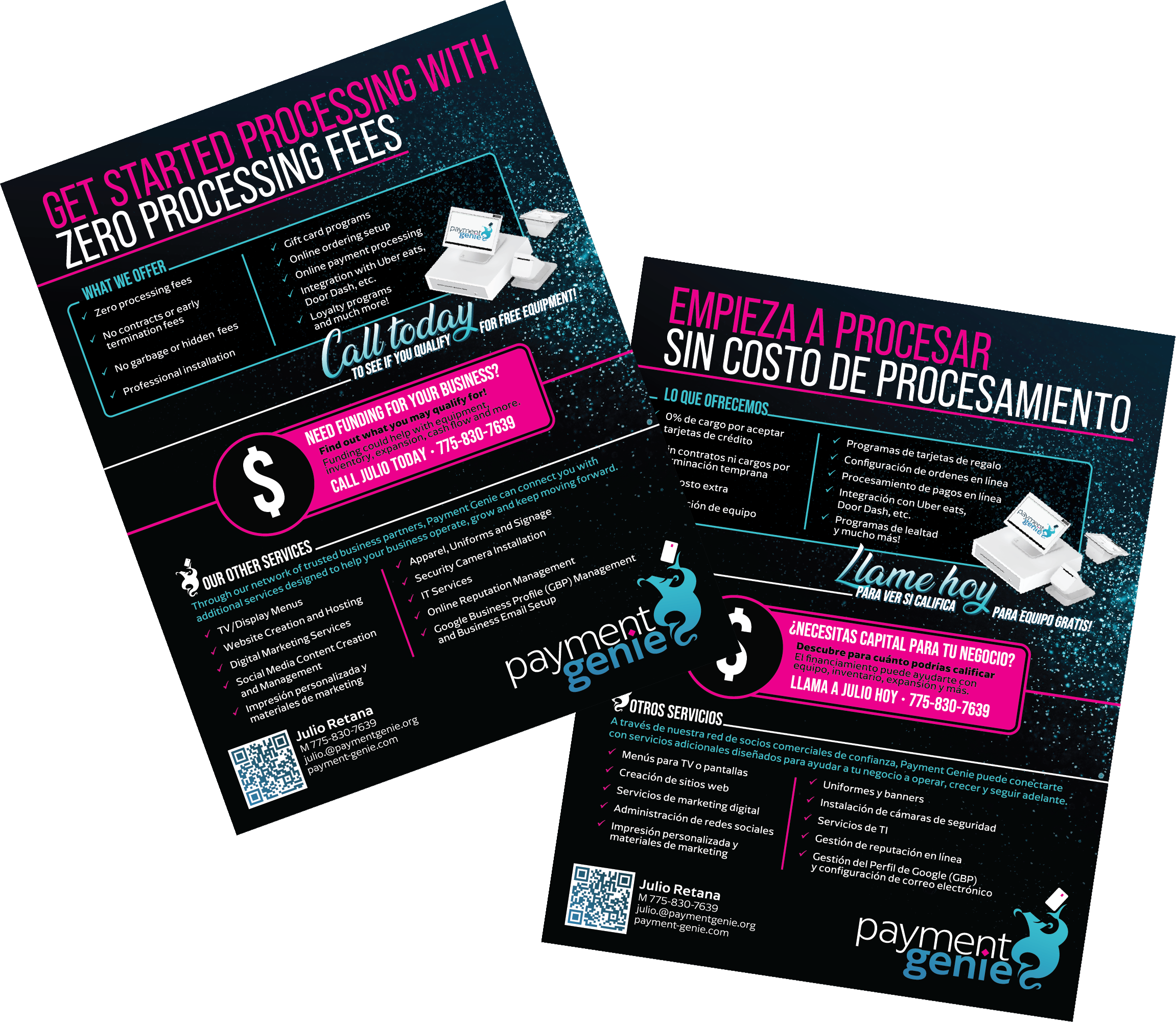
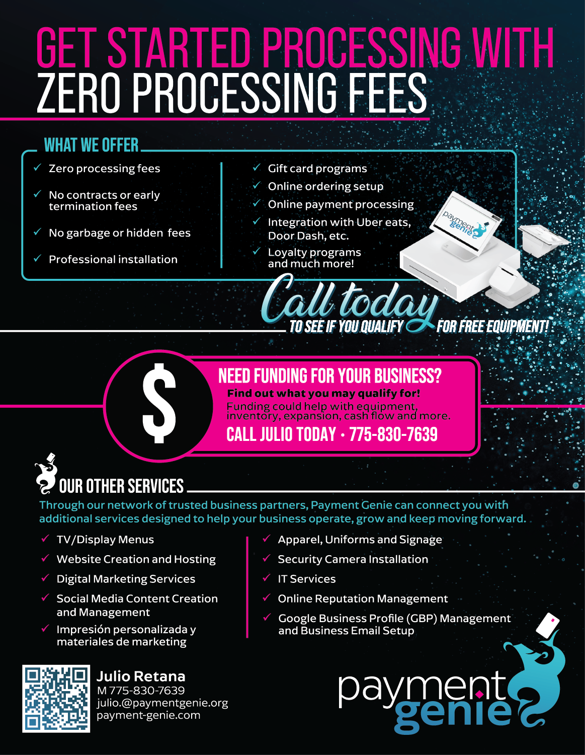
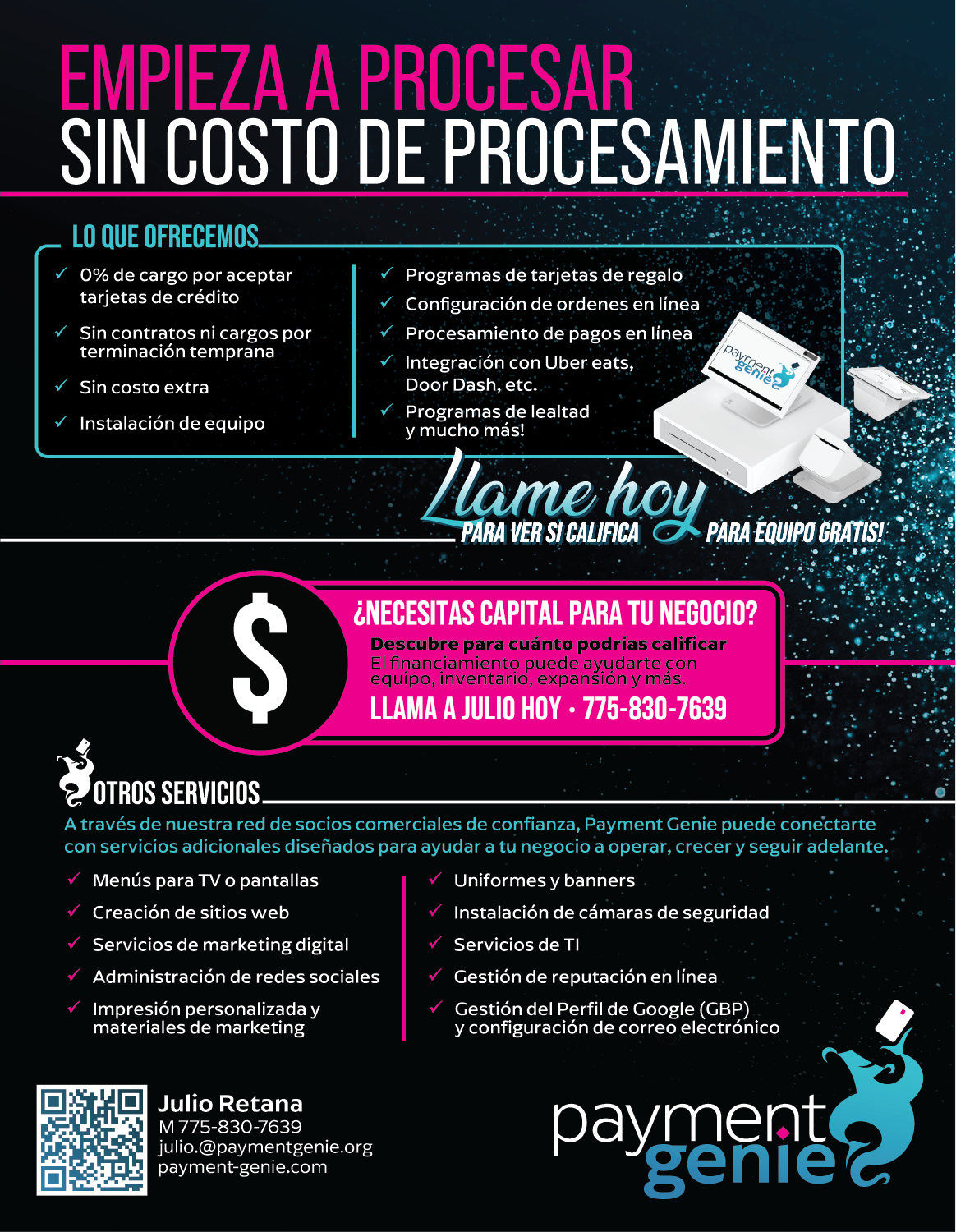
As Payment Genie expanded its services, I developed a double-sided promotional flyer to communicate its offerings to potential customers. With English on one side and Spanish on the other, the design allowed the company to reach both audiences through a single printed piece.
The flyer incorporates the established brand colors, typography, and visual elements, with bold headlines and a clear information hierarchy. Special attention was given to accommodating differences in language and text length while maintaining a consistent layout and visual identity across both sides.
BRANDED APPAREL
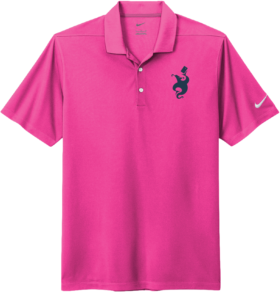
I also extended Payment Genie's visual identity into branded apparel, adapting the logo and supporting graphics for different garments and applications.
Considerations such as garment color, print method, artwork placement, scale, and contrast helped ensure the branding remained recognizable and visually consistent. These pieces move the identity beyond traditional marketing materials and become part of the company's everyday presence.
Embroidered Polos
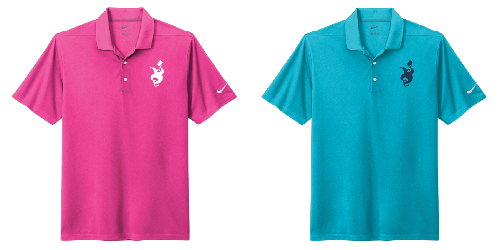
6 color combinations created
Specialty Vinyl Hats

4 color combinations created
DTF Decorated T-Shirts
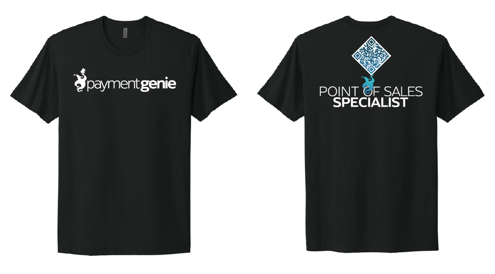
8 color combinations created